Overview
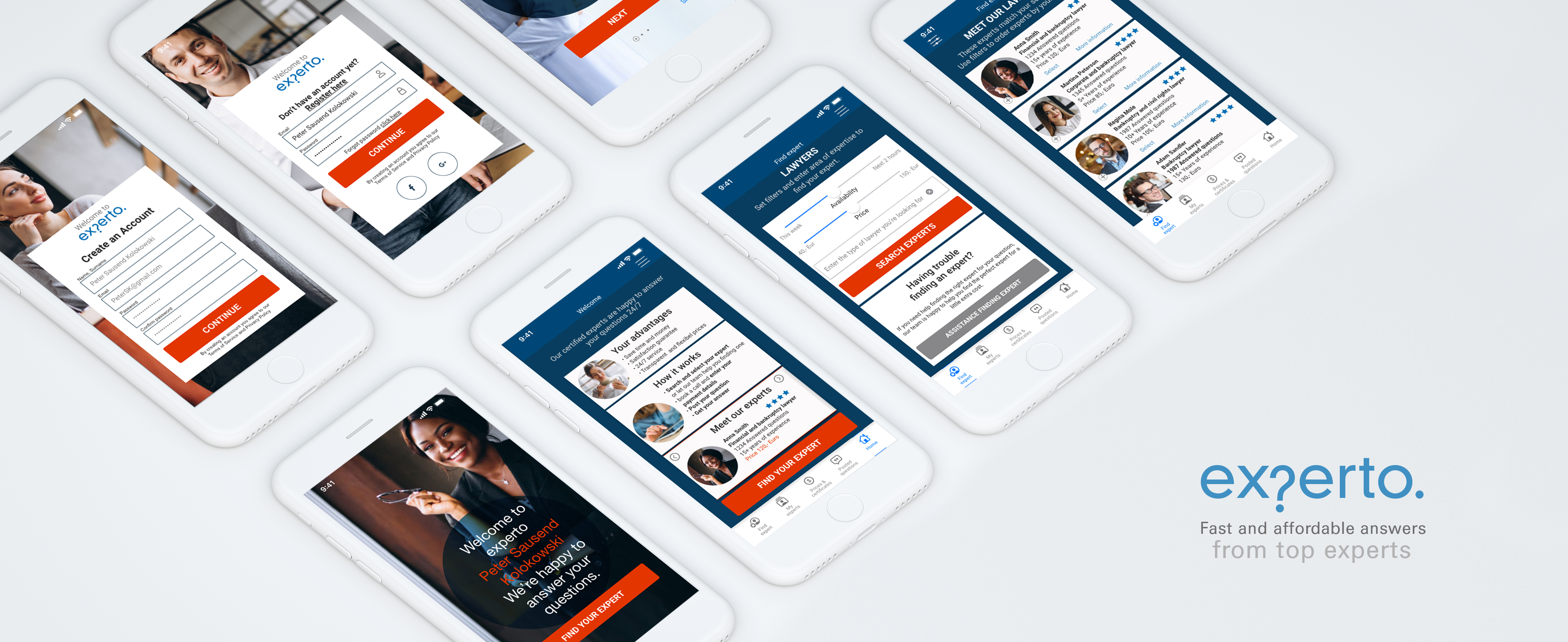
Most of us turn to the internet when we have questions regarding certain topics. experto is a platform that offers trustworthy answers from verified and certified experts, using a clear and transparent price model easy to be adapted to the needs of the user.
Early research showed, that although most people look for answers to their questions online, when these questions are more serious or demand a trustworthy answer they have difficulties finding a platform where they feel they are getting specialized expert advice as good, serious and trustworthy as if making an offline, face to face consultation with an expert.
Approach
I followed the User Centered Design and Design Thinking approach to meet the users needs and expectations in the best possible way. By crafting a problem statement and using the double diamond strategy I understood possible problems users might face and found solutions for those.
I made research and interviewed potential users to discover their needs. With the findings of this research I created different user personas representing expertos target groups. For these I created user journeys and user flows. These defined core functionalities of the app.
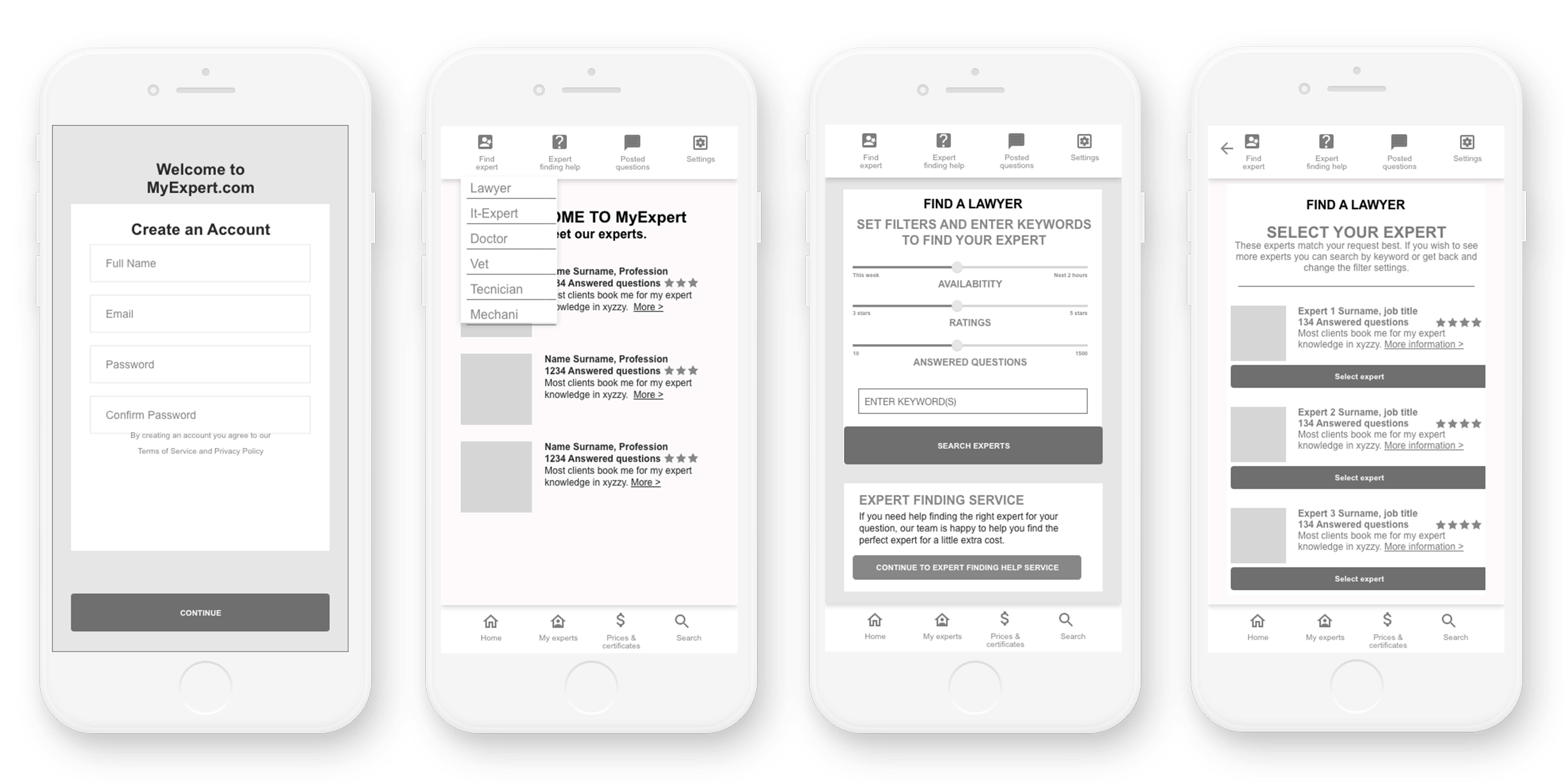
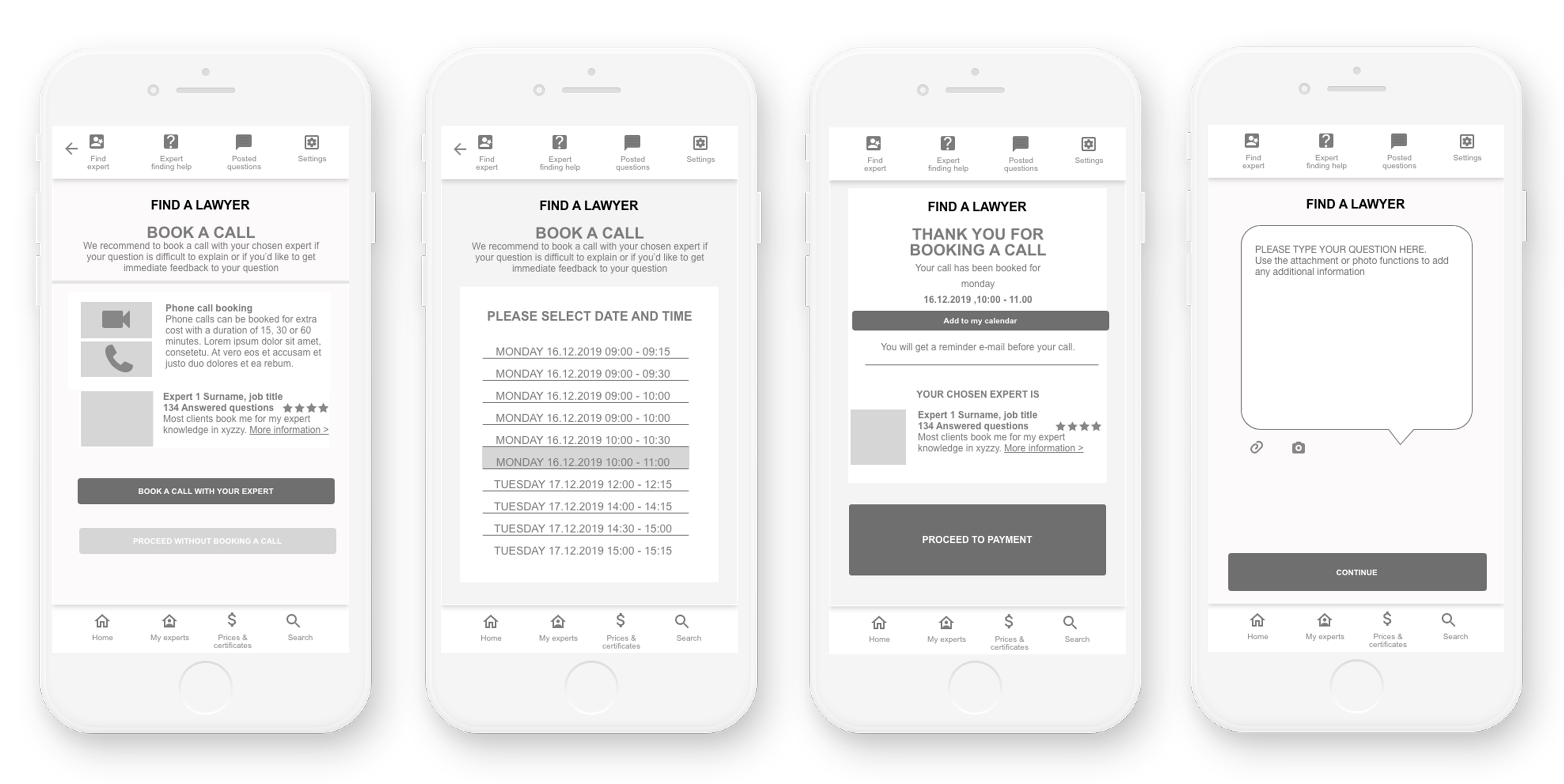
Next I created the information architecture. Card sorting methods gave me insights on what users find intuitive and logical. I then created wireframes that were tested. User testing and the use of affinity maps gave me valuable knowledge to make improvements. This included that the structure of the navigation was not intuitive enough and that paying for a service before it is provided makes the user feel uneasy. Based on the findings I made iterations and improvements and created a high fidelity prototype. To ensure the design adds value to the user experience I applied visual design principles and identified accessibility issues and improved these.

Objective
The objective of this platform is to provide the user the answers of experts on a range of very different fields with a service that feels trustworthy and personal. The quality of the service aims to be as good as an offline consultation adding the advantages of an online service: no waiting times, 24/7 availability, flexible and transparent price models and a satisfaction guarantee.
Credits and Tools
In this solo project I took different roles:
User researcher, information architect, UX/UI desiger and user tester.
I used different online and offline tools such as paper and pen, sticky notes, Balsamiq, Surveymonkey, Optimal Workshop, UsabilityHub, and Adobe XD.
Duration
I developed this project for the past eight months within my
CareerFoundry UX Certification.
Competitive analysis, SWOT Profiles
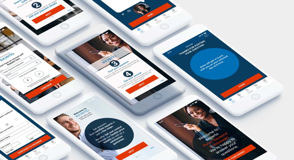
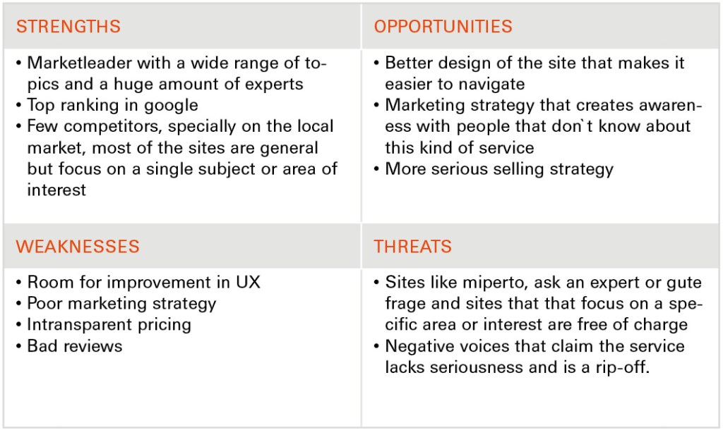
The analysis included an overview of the business, a marketing profile and a SWOT analysis. Each analysis gives insights and on how to position the app best to be able to compete within its segment.

User Interview analysis
To find out users attitudes as well as their needs when making online expert consultations I made an online survey with 12 participants and interviewed 3 potential users with an age range from 30 to 55. To organize and prioritize the information I used the affinity mapping technique.
Insights
- Users find it very important to have a fixed and transparent price to avoid unpleasant surprises
- Users want to have some background information regarding education and past career of the expert when making a choice
- Users find it very important to be able to be sure that the information they`re being given is trustworthy
- User find it important to have a fast service
- Having a service that is more affordable than consultations in person could be a way to make the service interesting
- For the app to succeed, it is crucial to be able to gain the trust of the user
- Users should have the possibility to have face to face contact to the person that will take care of their matter
User Personas
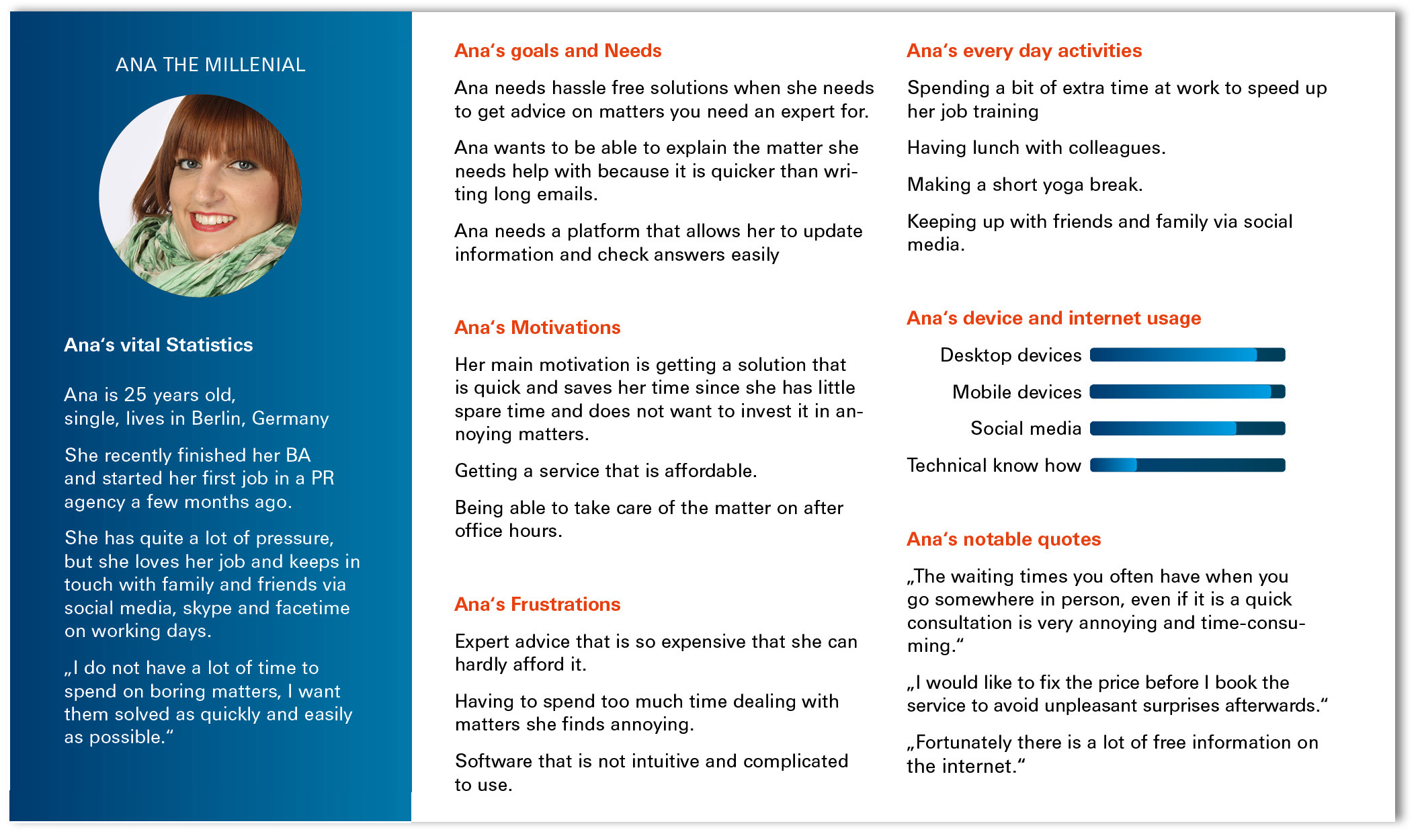
Based on the insights gained from the survey and the interviews, I created user personas which embodied the behaviors, needs and motivations of my target audience. User personas made it easier to put myself in the users shoes through the entire design process and helped me define and prioritize the functions and features of the app.

User Journeys
I created user journey maps to visualize what the user wants to accomplish and which steps he has to take to achieve his goal. This allowed me to empathize with the user and gain deeper understanding of the user‘s motivations and thought processes and of the emotions he might be going through when using the product.

User Flows
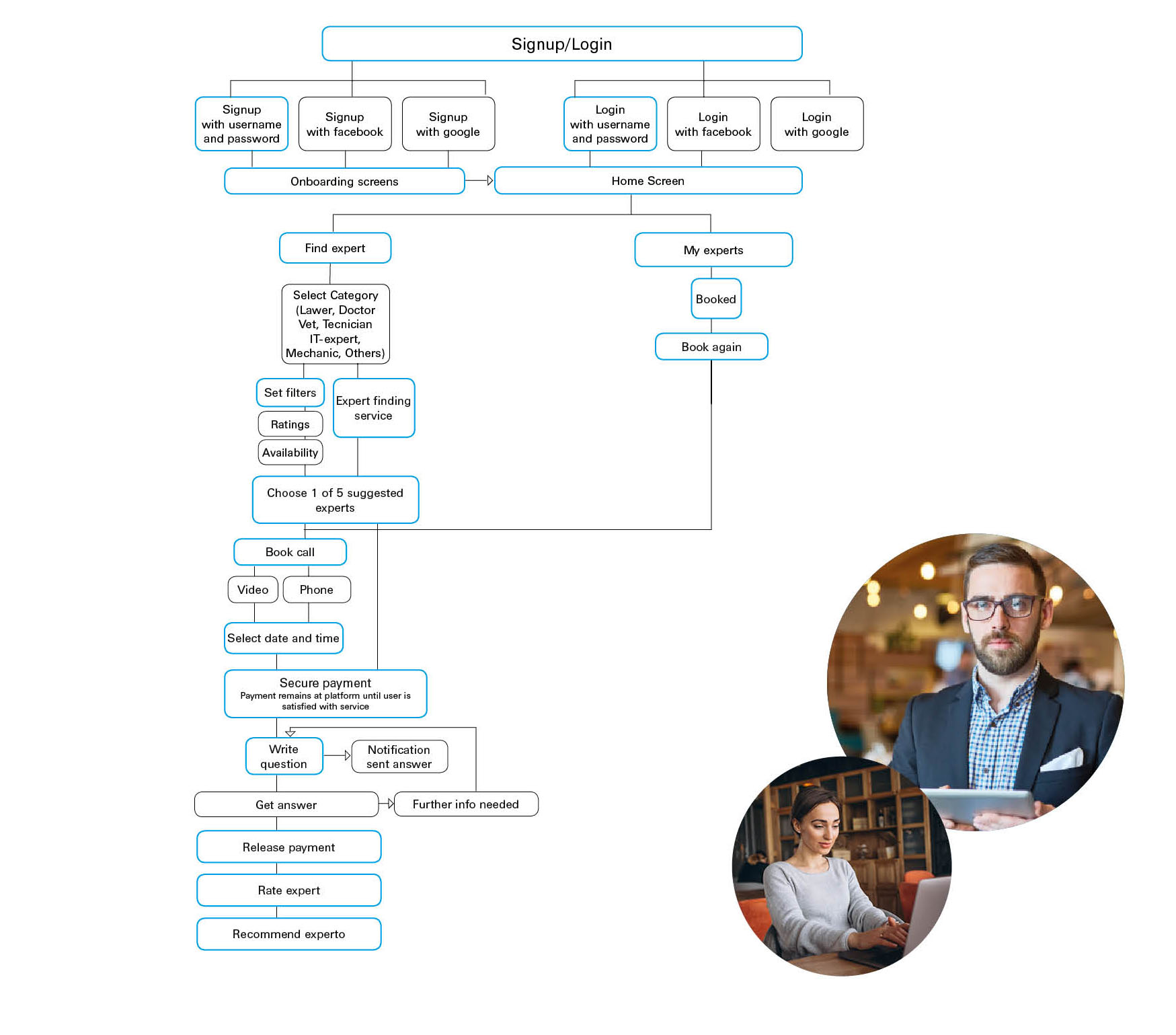
Based on the user journey maps and keeping in mind the needs of the user, I designed user flows to identify each step towards a user‘s goal.
Sketching and Prototyping
Low fidelity
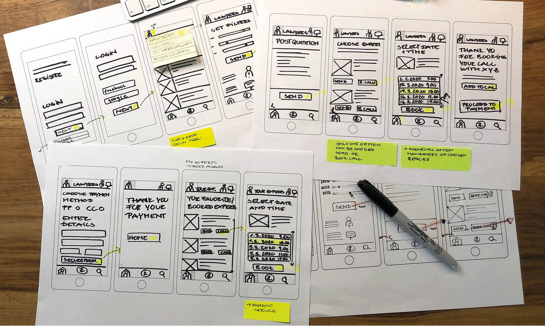
Next I created sketches in different fidelities, those were tested and iterated over and over again to make improvements regarding the usability and the design.
Mid Fidelity Wires
User Testing
I conducted usability tests with 5 participants in person. This allowed me to test the utility and the usability of the app, to ensure that the user has all the functionalities to be able to complete his task and that these are easy and intuitive to use, bringing satisfaction when using experto. To structure and organize the gathered information I used a Rainbow Spreadsheet. To improve the visual part of the app I made preference tests with a high fidelity prototype.
Learnings
Issue 1: User does not want to pay before getting a service, or at least wants some sort of guarantee, that they won‘t end up being tricked out for a service that did either not take place or they were not satisfied with. Severity: High
Issue 2: Unclear how much the service is going to cost. Severity: High
Issue 3: Not clear what the keyword field is for or omission of the keyword field.
Severity: High
Issue 4: Split navigation (upper and lower part of the screen) makes it more difficult to complete tasks. Severity: Medium
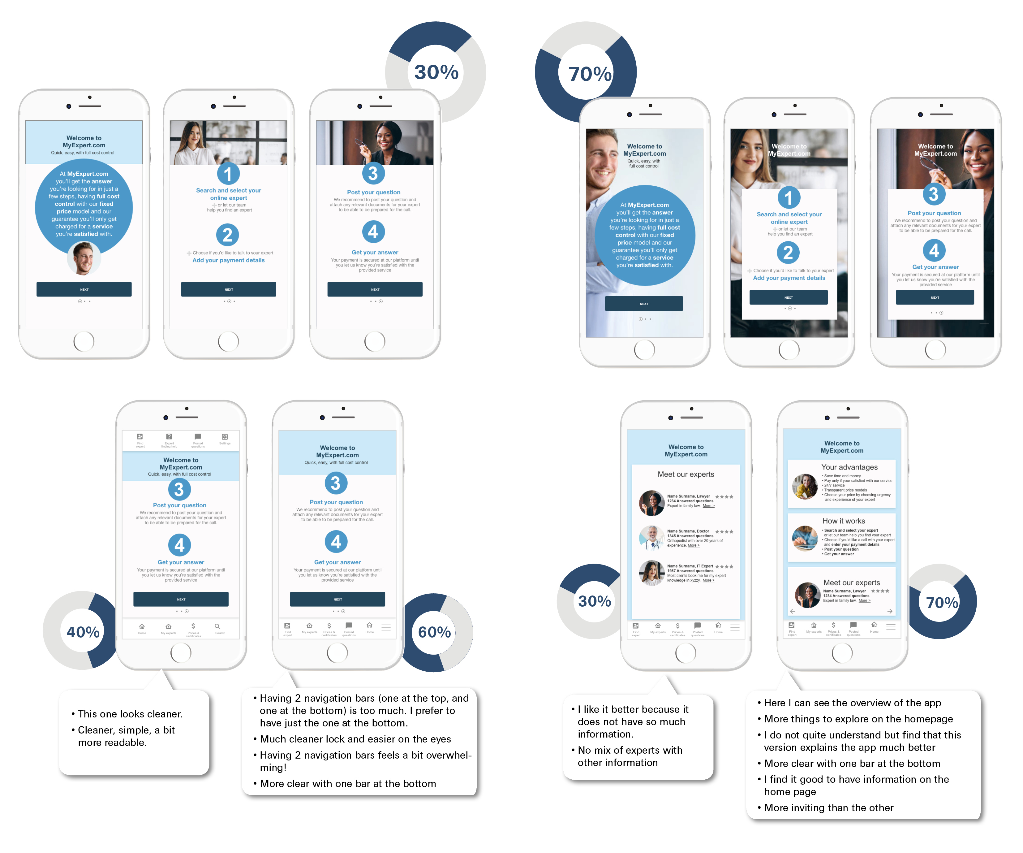
Preference Testing
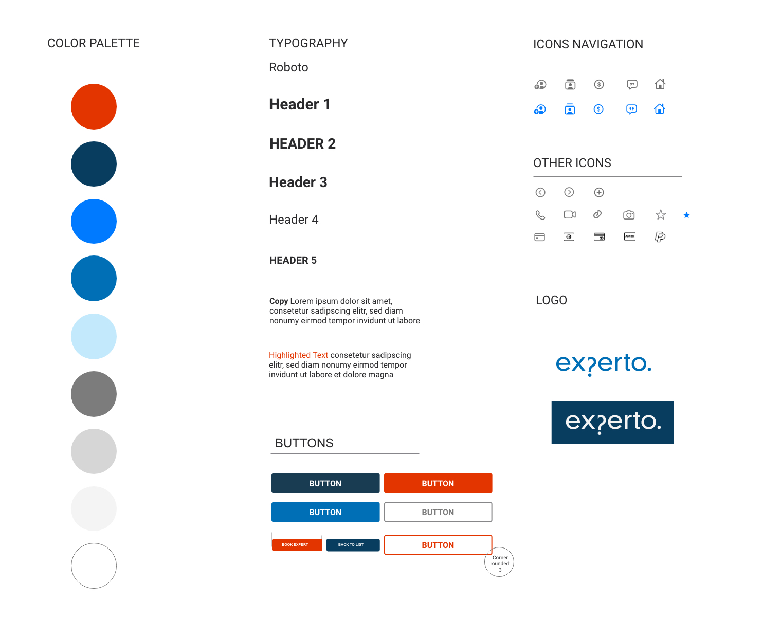
Styleguide
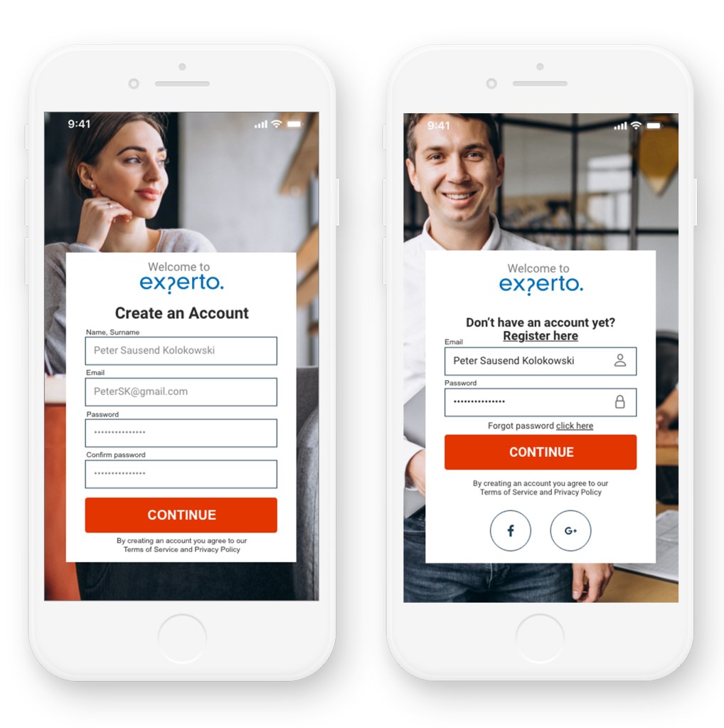
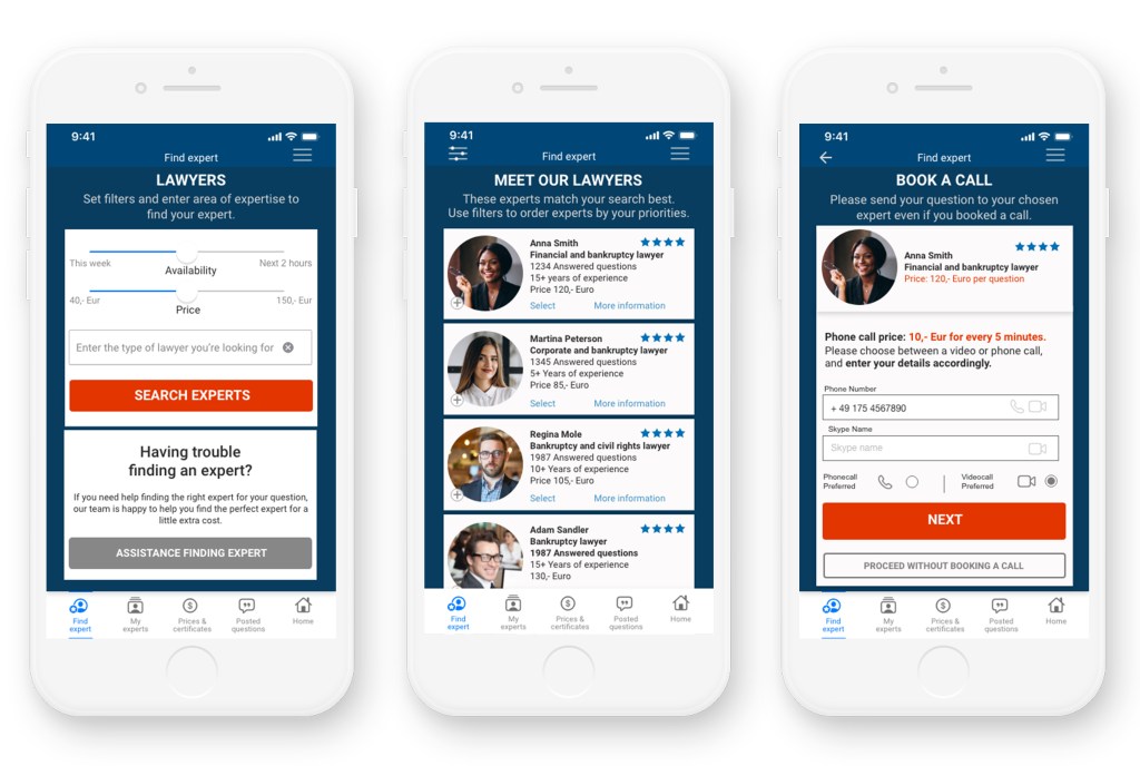
Final Showcase
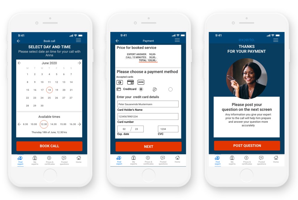
The current prototype went through several iterations to address the needs of the user such as not wanting to make online consultations due to lack of trust, wanting to avoid price surprises, having a service that is affordable and adjusts to their budget to a certain extent and having a service that is personal and offered within a chosen timeframe.
The look and feel gives the user the first impression of a platform that is highly professional and trustworthy. The color blue transmits reliability and stability, orange is associated with being lower in price and gives the design a bold and fresh look. In addition, the experts are shown in a highly professional environment. This first impression is reinforced by the implemented features like being able to vary the price according to the urgency of the needed answer and having full cost control through the offered transparent price models. Other elements were implemented to gain the users trust are the certificates, the satisfaction guarantee and the ratings feature.
The fear of having an impersonal service was also addressed through offering a service where the expert can not only be chosen but talked to directly, rated and booked again. Basically the user is getting a service that has the quality of an offline consultation. On top, he has extra advantages like no waiting times, fast service, 24/7 availability and full cost control.


Link to current experto prototype