
Overview
Cars have become a technical mistery for car owners. Making it very difficult to make repairs or understand error codes. Carly offers a solution for this problem with an adapter and an app that allow car owners to read, understand, and clear error codes. Health diagnostics can be done, coding functions that are not enabled by the car brands can be turned on and off for many car brands.
The licence for the app can be bought online and via app store. Carly wanted to improve its in-app salespage.
Approach
The former page was extremely reduced and did only offer purchase buttons to buy the app and or the adapter. Based on the available user data I identified possible issues and used the double diamond strategy to understand possible problems users might face and come up with solutions for these.
Using the available information and Carlys defined personas I created user journeys to try to understand pain points and expectations.
Next I developed different ideas on how to address the needs of the user. Within the team we chose one approach, based on this I created a high fidelity prototype. I tested the prototype with 4 users in a one to one interview and with 30 users on a remote test. Based on the findings I made iterations and improvements. The page was tested 50:50 against the old page performing better. The release took place for black week.
Objective
- The objective of this page is to increase sales by reminding the user of the most valuable features Carly has to offer
- Making clear what is needed to use Carly
- Giving the user a clear and visually appealing buying experience and enough information to make a buying decision
Duration
The first part of the development of this MVP took 6 weeks from the kick-off to having a page that was programmed and ready to be tested. After 10 weeks it was running on Android and still being tested on iOs.
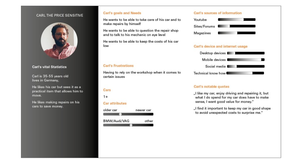
Personas

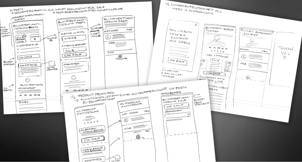
Sketches
I created low fidelity sketches to visualize different Ideas and approaches.
Current showcase
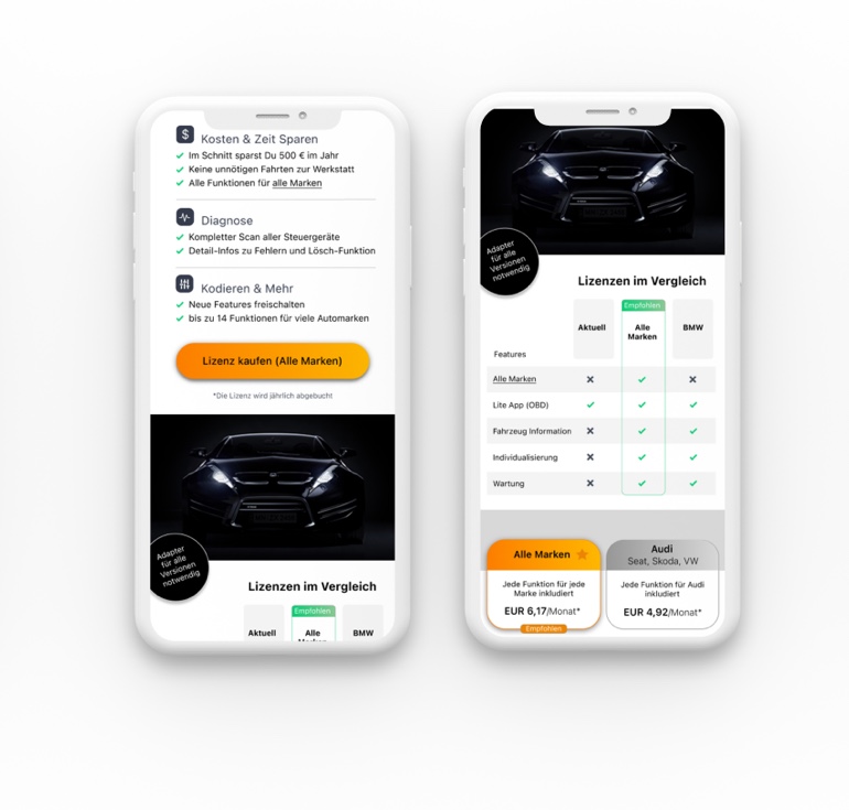
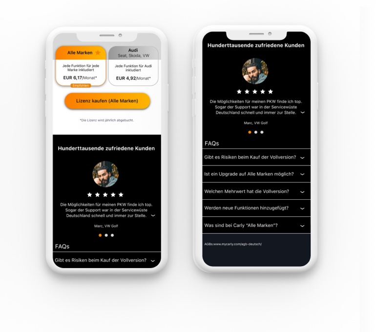
The current page went through several iterations to address needs like: Visualizing what needs to be bought, providing brand specific information on available features for the car and for different pricing plans.
The look and feel is intended to give the user the feeling he is about to buy a high quality technical product. Emotion was added by using a visual of a (brandless) sports car. I used Carlys visual elements and created a structure by using white and black backgrounds.
Since the page is intended to address different users with different needs (regarding car brands or the purchase stage) the created design is made out of different blocks that can be added or removed depending on the customer.
Further tests will be made to keep on improving this page. Once the page has been optimized, previous steps will be added in which the user will be asked about his preferences so that the page can be adjusted to his needs even more precisely.

Retrospective and next steps
Understanding the product itself has been a challenge, since it is very complex and does have different features for different brands. This as well as the fact that there is a need to inform and educate the user had to be taken into consideration when creating the new page.
In retrospective, I believe I should have asked the users much earlier and not only when testing the product instead of relying only on the available data. I think this would have been an important step towards gathering more insights.
Different aspects (like putting the sale of the app first, including further explanations about the combination of the app and adapter or showing the price per month and per year when buying) will be iterated and tested again to see if the conversion rate can be improved further.
Please contact me if you’d like to see the complete case.
